Koordinates
Making version control for spatial data easier to understand and use.
Highlights
- GIS version control for non-developers
- Workflow design and information architecture
- Interactive prototypes and user testing
- Shared UI patterns across app and web
Role
Product Designer
Tools
Figma, Adobe Creative Cloud
Skills
Design Systems, Information Architecture, Project Management, Prototyping, User-Centered Design, User Research, UX/UI Design, Visual Design, Wireframing
Length
1+ Years
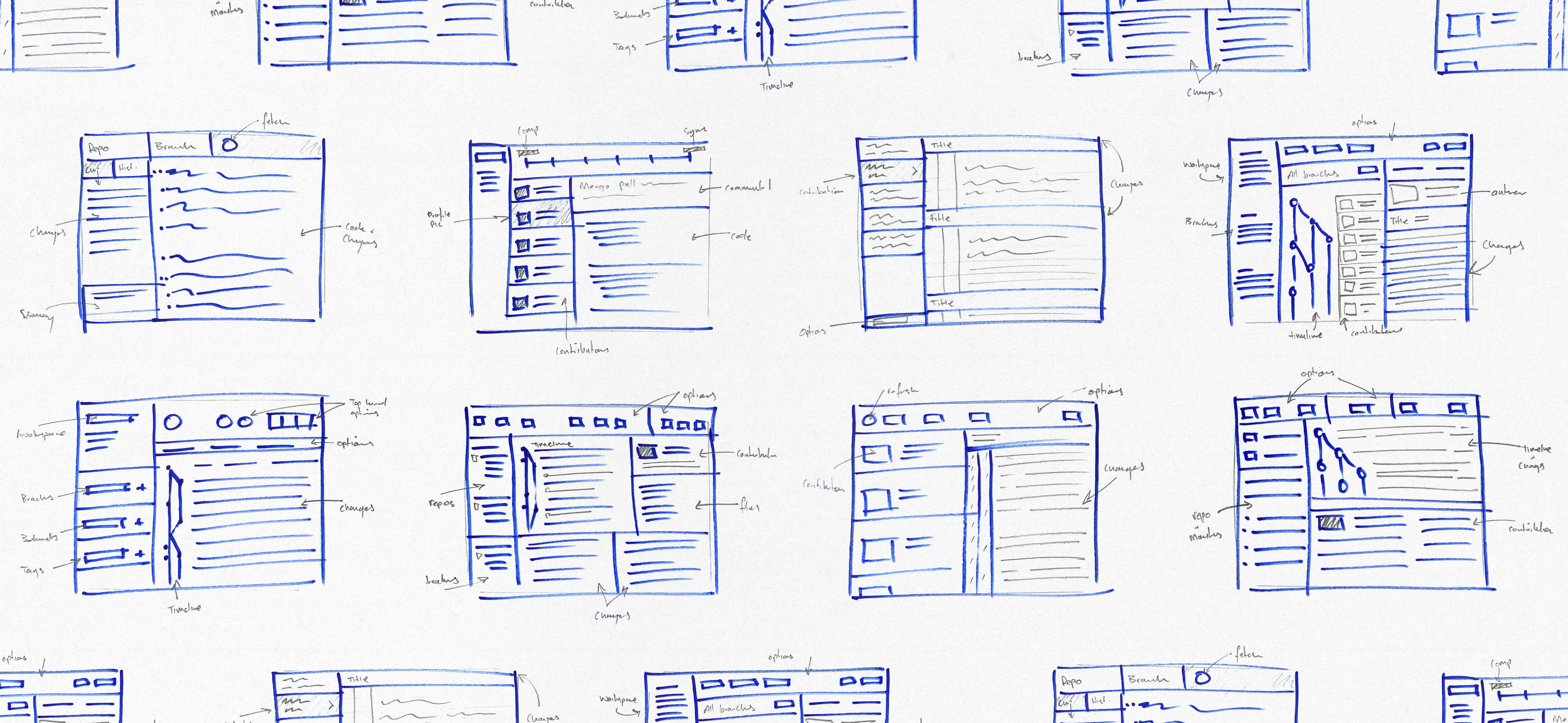
Early wireframes – figuring out how to structure a “Git for maps” product without leaning too hard on Git language.
Koordinates had built Sno, an open-source wrapper around Git for spatial data. It worked well if you were comfortable in the command line, but a lot of GIS users weren’t. The job was to design an app that made version control easier to understand and use without expecting people to think like developers.
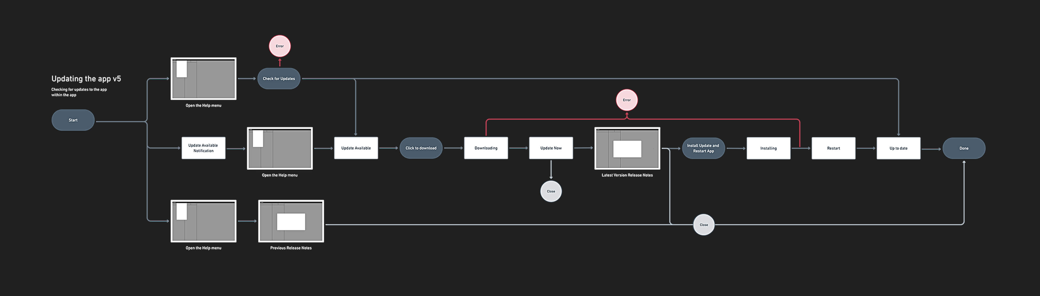
Exploring one of the update flows in the app.
We started by mapping out the main workflows and working through how much Git language needed to be translated. The challenge wasn’t to hide what the product was doing, it was to make it feel familiar enough to use. We borrowed cues from mapping tools and everyday desktop apps, stripped back some of the jargon, and focused on the actions people were actually trying to take.
Prototypes helped us test ideas quickly and keep the work moving.
Prototypes were a big part of the process. They made it easier to test ideas with in-house GIS and Git experts, and they also showed us pretty quickly where labels were too technical or actions were buried.
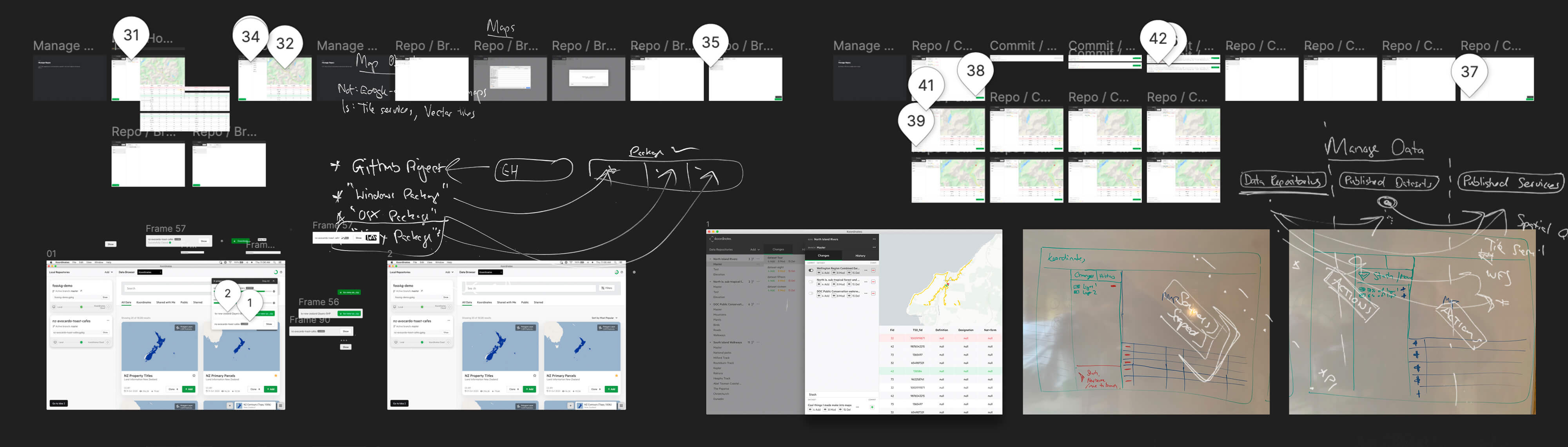
Feedback came through Figma, Slack, whiteboard photos, and all sorts of channels.
As the app took shape, I built out a library of reusable patterns in Figma — things like tables, map previews, version history views, and other shared UI. That sped up the work and helped keep the app aligned with the Koordinates web platform as both products evolved.
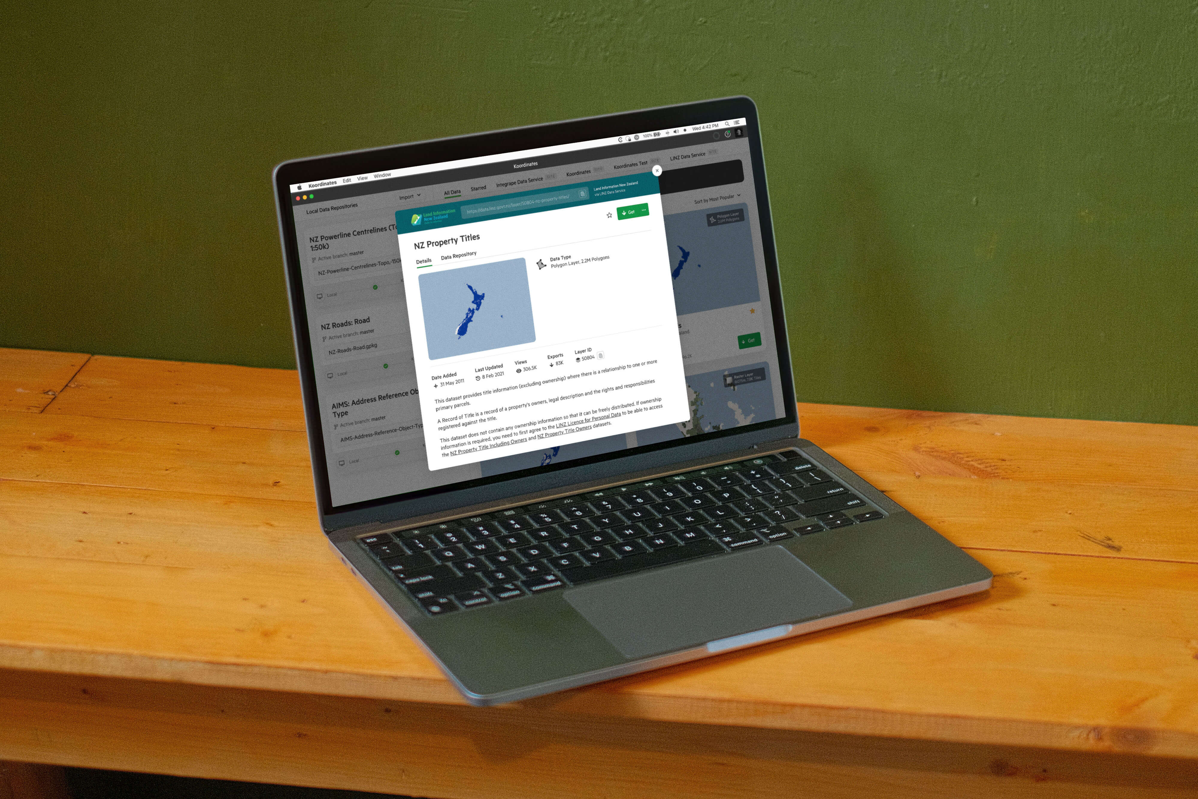
Keeping the desktop app and web platform visually aligned.
The beta app landed well. Users responded to the fact that it handled the complexity of spatial data without making the product feel like a developer tool.
A big takeaway from this project was that you can’t just wrap technical concepts in a nicer interface and call it done. We had to work out what needed translating, what needed to stay precise, and where a shared pattern library could save time and cut out noise so we could focus on real user problems.